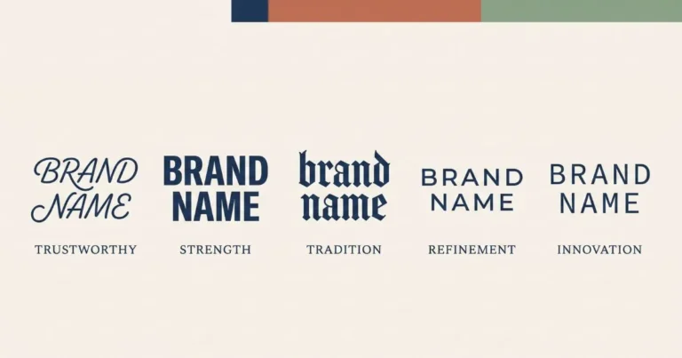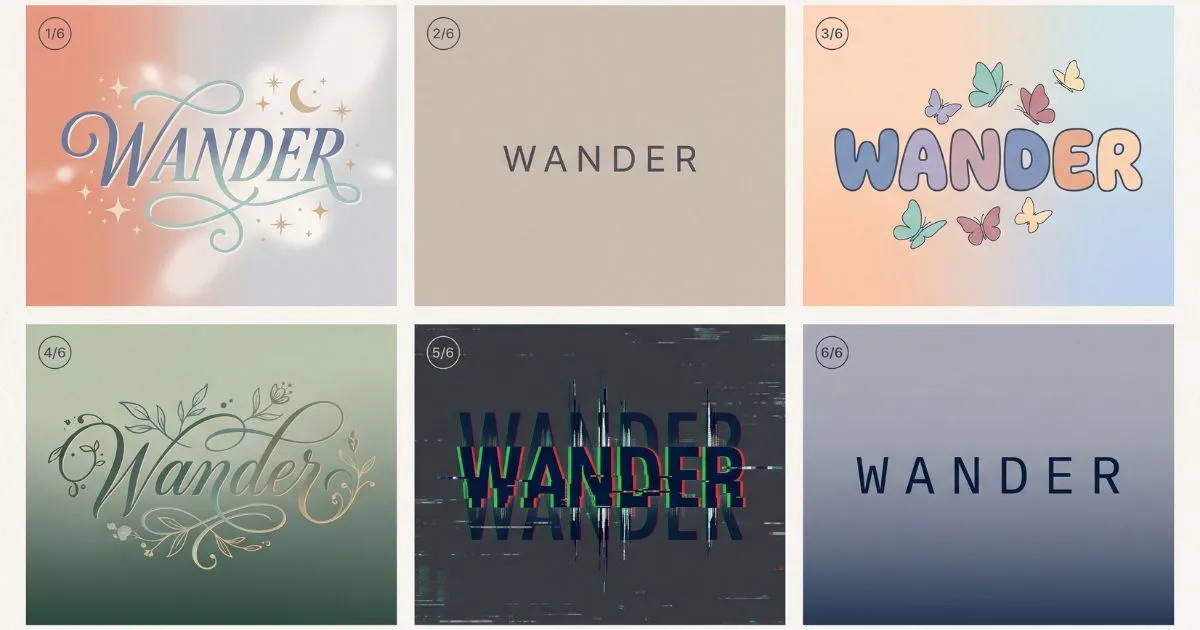
Aesthetic Fonts: The Complete Guide to Styles by Subculture
What Makes a Font “Aesthetic”?
Aesthetic fonts are not a category typographers recognise. There is no Unicode block called Aesthetic, no type classification that includes it, no design school that teaches it. The term emerged from Tumblr and Instagram sometime around 2018 and now describes something real that had no name before: text styling that signals membership in a specific visual subculture.
Search volume for the term runs into hundreds of thousands monthly. The people searching are not looking for typefaces. They are looking for a mood — soft, dreamy, minimal, dark, nostalgic — expressed through letterforms they can paste into a bio.
The Subcultures and Their Typography
Soft Aesthetic
Pale colours, cloud imagery, gentle everything. The typographic signature is light script with sparse decoration — a cursive name framed by a single star or heart symbol, nothing heavier.
The style avoids weight entirely. Bold reads as aggressive within this subculture. Even the decorative symbols skew light: ☁, ✿, ୨୧, ˚୨୧⋆。. Accounts working in this space tend toward maximum restraint in stroke weight paired with careful symbol placement.
Dark Academia
Libraries, tweed, autumn, Latin phrases. The aesthetic borrows from an idealised European university tradition, and its typography follows: serif styles, small caps, occasionally gothic Fraktur for something with genuine historical weight behind it.
What separates dark academia typography from generic gothic is restraint. A dark academia account might use small caps for a name and nothing else — no symbols, no frames, no decoration. The reference is to printed books, where typography serves reading rather than display.
Y2K
Chrome, butterflies, low-rise everything, early internet nostalgia. Y2K typography reaches for the visual language of 2000s web design: bubble letters, wide-spaced monospace, mixed-case chaos, and symbols that evoke MSN Messenger.
This is the least restrained aesthetic on the list. Where soft aesthetic and dark academia both operate through subtraction, Y2K works through accumulation — multiple symbols, mixed styles within a single line, deliberate visual noise.
Cottagecore
Gardens, bread, rural fantasy, hand-made everything. The typography emphasises the hand: flowing script styles, botanical symbols, nothing that looks machine-generated.
Cottagecore and soft aesthetic overlap significantly in typography but diverge in symbol choice. Soft aesthetic reaches for celestial imagery — stars, clouds, moons. Cottagecore reaches for botanical — 🌿, ❀, 🍄, ✿.
Grunge and Alt
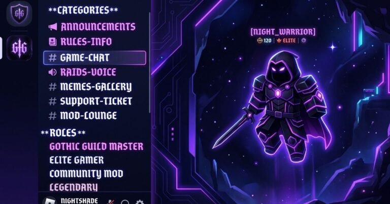
Distortion, decay, deliberate ugliness as a statement. Typography uses strikethrough characters, combining marks that create glitch effects, and heavy gothic styles applied without the historical reverence dark academia brings to them.
The technical mechanism here is different from other aesthetics: instead of substituting styled characters, grunge typography usually adds combining marks — zero-width characters that stack on top of existing letters to create strikethrough, underline, or glitch effects.
Minimal and Clean
White space, sans-serif, nothing extra. This aesthetic rejects decoration entirely, which creates an interesting typographic problem: how do you signal intentional design through restraint?
The answer that emerged is small caps and light monospace — styles that read as deliberate without reading as decorated. A minimal account might style only its name in small caps and leave everything else in plain text. The styling is nearly invisible, which is the point.
Why Aesthetics Cluster Around Specific Styles
The pairings above are not arbitrary. Each aesthetic has a coherent visual philosophy, and typography either supports or contradicts it.
Soft aesthetic prioritises gentleness. Heavy typography contradicts gentleness, so soft aesthetic uses light script. Dark academia prioritises intellectual seriousness and historical reference. Playful bubble letters contradict that, so dark academia uses serif and small caps. Y2K prioritises maximalist nostalgia for an era of visual excess, so Y2K typography is excessive.
When an account uses typography that contradicts its aesthetic, the mismatch registers immediately even to viewers who could not articulate why. A cottagecore account with gothic Fraktur styling looks wrong. Not offensive, not broken — just wrong in a way that undermines the aesthetic it is trying to build.
The Character Economy Problem
Aesthetic typography faces a constraint that other styling approaches do not: decorative symbols consume characters, and bio limits are tight.
On Instagram’s 150-character bio, a heavily decorated aesthetic bio might spend 30 characters on symbols alone. On TikTok’s 80-character limit, that same decoration consumes nearly 40 percent of available space. The visual result may be worth it for accounts where aesthetic identity matters more than information density — but it is a genuine trade-off rather than a free addition.
The accounts that handle this best tend to concentrate decoration in the display name field, which has its own separate character allowance, and keep the bio itself relatively plain. This preserves the aesthetic signal while leaving room for actual content.
Cross-Platform Reality
Decorative symbols render less consistently than styled alphabet characters. Mainstream styles — script, bold, small caps — appear on virtually every modern device. Specialised decorative symbols, particularly newer ones or ones from less common Unicode blocks, may render as empty boxes on older phones or budget Android devices.
This affects aesthetic typography disproportionately because aesthetic styling relies on symbols more heavily than other approaches. A soft aesthetic bio built around ୨୧ and ˚。⋆ may look perfect on a current iPhone and partially broken on a three-year-old Android.
The practical guidance: test decorative symbols on at least one non-primary device before committing to them. Common symbols — stars, hearts, basic geometric shapes — render reliably. Ornate or unusual ones carry more risk.
Building an Aesthetic Bio That Works
Start with the aesthetic, not the font. Decide which visual subculture your account belongs to, then choose typography that supports it. Working the other direction — picking a style you like, then trying to build an aesthetic around it — produces incoherent results.
Style one element. Across every aesthetic, the accounts that perform best style either the display name or one short bio line, not both. The styled element carries the aesthetic signal; the plain text carries the information.
Match symbol density to the aesthetic. Soft aesthetic and cottagecore support light decoration. Minimal supports none. Y2K supports heavy decoration. Applying uniform symbol density across different aesthetics produces the mismatch problem described above.
Test the full bio in context. A bio that looks balanced in a font generator preview may look different on an actual profile with an avatar, follower count, and action buttons surrounding it.
To find styles matching a specific aesthetic, the font generator groups styles by visual category — the Aesthetic section covers the soft script and decorated variants that dominate this space, while Dark & Gothic covers the heavier styles that dark academia and grunge accounts reach for.
The Accessibility Note
Screen readers announce styled Unicode characters by their formal Unicode names rather than reading them as ordinary letters. Decorative symbols receive the same treatment — a heart symbol is announced as “heavy black heart” rather than being skipped.
For an aesthetic bio built around styled text and multiple decorative symbols, this can produce a genuinely unusable audio experience. The mitigation is the same principle that produces better visual results anyway: style one element, keep the rest plain. The aesthetic signal survives; the information stays accessible.
Frequently Asked Questions
What is the most popular aesthetic font style?
Light cursive script remains the most widely used, particularly in soft aesthetic and lifestyle accounts. Small caps is growing fastest, driven by minimal and dark academia communities.
Do aesthetic fonts work on all social platforms?
The styled alphabet characters work on any platform accepting Unicode text — Instagram, TikTok, Discord, X, Threads. Decorative symbols work equally broadly but render less consistently on older devices.
How many decorative symbols should I use?
Depends on the aesthetic. Minimal supports zero, soft aesthetic supports two to four, Y2K supports more. Across all aesthetics, symbols surrounding a single styled element outperform symbols scattered throughout an entire bio.
Why do some aesthetic symbols show as empty boxes?
The device lacks a font covering that specific Unicode character. This affects unusual decorative symbols more than common ones. Switching to a more widely supported symbol resolves it.
Can I mix different aesthetic styles?
Technically yes, but mixing usually weakens both. Each aesthetic has a coherent visual philosophy; combining contradictory ones produces something that reads as unintentional rather than eclectic.