Fancy Unicode Text on iPhone, Android, Windows & Mac: What Can Change?
Quick Answer
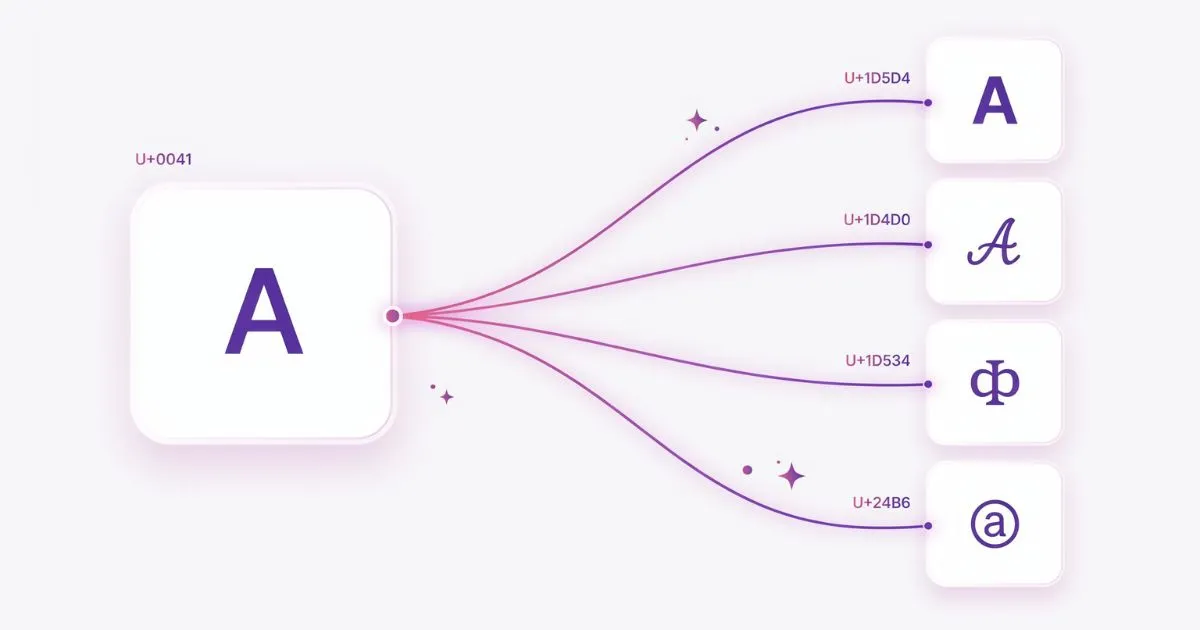
Styled Unicode text — including bold, cursive, and gothic characters from font generators — can look slightly different across iPhone, Android, Windows, and Mac. The Unicode characters themselves remain the same, but the font, fallback chain, app, browser, and operating system used to render them can affect their appearance. Differences may appear in stroke weight, spacing, character size, curves, and alignment. These variations are not necessarily errors; they are often a result of different rendering environments and available fonts.
Why the Same Unicode Text Can Look Different
It is common to copy styled Unicode text from one device and notice that it looks slightly different when viewed somewhere else. The characters have not necessarily changed. What has changed is the environment responsible for drawing them on the screen.
Different operating systems, browsers, and apps can use different fonts or fallback fonts for Unicode characters. This means the same encoded text can retain its identity while its visual appearance changes slightly from one device to another.
A Simple Example
Take the phrase “Hello World” and convert it into styles such as Bold, Italic, Script, Fraktur, or Double-Struck. Copying the resulting Unicode characters between devices does not turn them back into ordinary letters, but the device viewing them may use a different font to draw those characters.
That is why two people can view the same copied Unicode string and notice small visual differences without either version being technically incorrect
What Can Vary Between Unicode Styles
Bold Text
Bold Unicode styles are generally easy to recognize because their heavier letterforms remain visually distinct even when the rendering font changes. However, weight, spacing, size, and alignment can still vary depending on the device, browser, application, and fonts available.
Italic Text
Italic Unicode characters preserve their encoded identity across platforms, but the exact angle, spacing, curves, and proportions can vary with the font used to render them. Longer strings can make these differences more noticeable than short names or single words.
Script (Cursive)
Script characters can show noticeable visual variation because cursive letterforms depend heavily on the design of the rendering font. Curves, flourishes, spacing, and the apparent connection between letters may therefore look different across environments.
Fraktur (Gothic)
Fraktur characters have distinctive shapes, so their overall gothic appearance usually remains recognizable. Even so, stroke weight, proportions, spacing, and individual letterforms can vary between fonts.
Double-Struck (Outline)
Double-struck characters can also vary in stroke thickness and spacing. At small sizes, some rendering fonts may make their internal lines or outlines less clear, so readability should be checked in the place where the text will actually appear.
Why This Happens
None of this is a bug. It’s the direct consequence of how font fallback works.
When software needs to display a Unicode character, it looks for a font containing a suitable glyph. If the preferred font does not contain that character, the operating system, browser, or application may use another font through a process commonly called font fallback. The exact fallback chain is not universal. It can depend on the operating system version, installed fonts, browser, application, language settings, and other rendering decisions
Mathematical Alphanumeric Symbols used by many fancy-text generators may therefore be drawn by different fonts in different environments. Because those fonts do not necessarily use identical letterforms, the same Unicode character can look slightly heavier, thinner, wider, or differently spaced.
You’re not choosing a font when you style your text. You’re choosing characters. The font that draws those characters is decided entirely by whoever’s looking at the screen, not by you.
What This Means If You’re Styling Text for an Audience
If appearance is important, preview your styled text in the apps and devices that matter most to your audience. A style that looks clear in a desktop browser may appear slightly different inside a mobile app. A Discord server that’s mostly accessed from desktop can lean into styles that render well on Windows and Mac. A TikTok bio where most viewers are on mobile should prioritize how things look on the two major mobile platforms.
For a mixed audience, prioritize readability rather than expecting pixel-perfect consistency. Simpler styles are often easier to recognize when fonts or rendering conditions change, while highly decorative styles may show more noticeable visual differences.
Testing on your actual target devices beats guessing. If you have access to both an iPhone and an Android phone, pasting your styled text into a note app on each takes thirty seconds and removes the guesswork entirely.
The Accessibility Note We Can’t Skip
Styled mathematical Unicode can also create accessibility problems. Because these are different encoded characters rather than ordinary letters with visual formatting applied, assistive technologies may interpret or announce them differently from normal text. Behavior can vary by screen reader, operating system, application, settings, and version.
For important information, long passages, navigation, instructions, or text that everyone needs to understand, ordinary characters are the safer choice. Decorative Unicode is better kept to short, optional visual accents
Our Practical Takeaways
There is no single Unicode style that can be guaranteed to look identical on every device. If consistency matters, choose a readable style and preview it in the actual platform where you intend to publish it.
Using styled Unicode for a short heading, name, or phrase is generally more practical than converting an entire paragraph. The goal should be readable decoration, not identical typography on every screen
Frequently Asked Questions
Why does my styled text look different on my friend’s phone?
Different operating systems use different fonts to render Unicode’s mathematical alphabet characters. The characters are identical on both devices — the font drawing them is different, which changes the visual weight and spacing.
Is there one correct way styled Unicode should look?
Not necessarily. Unicode defines the character, but the exact glyph used to display it comes from a font. Different fonts can draw the same character differently, so small visual differences between devices do not automatically mean one version is wrong.
Will styled text look identical on two Apple devices?
Not guaranteed. Even devices from the same ecosystem can differ because rendering may depend on the operating system version, application, browser, font fallback, and other software conditions
Should I avoid certain font styles because of rendering differences?
Not necessarily. Choose styles based on readability and test them where they will actually be viewed. More decorative character sets can make differences in font rendering easier to notice.
Can I control which font renders my styled text on someone else’s device?
No. The rendering font is determined entirely by the viewer’s device and operating system. You have no control over how your styled text appears once it’s on someone else’s screen.




One Comment