Font Psychology: What Your Typography Says About Your Brand
Quick Answer
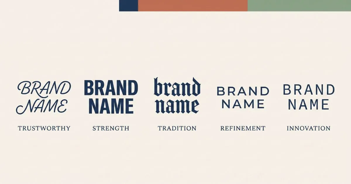
Font psychology is the study of how typeface choices influence perception before a reader processes any words. Rounded fonts read as friendly, heavy geometric fonts read as authoritative, script fonts read as personal. On social media — where you get one line of bio text and a display name — this happens in under a second. The typography you choose signals your category, your professionalism, and your audience before your actual message lands.
The Half-Second Judgement
Someone lands on your profile. Before they read your bio, before they look at your posts, they have already formed an impression from the shapes of your letters.
Research on visual processing puts initial aesthetic judgement somewhere in the 50-millisecond range. That is faster than conscious thought. By the time a visitor decides whether to read your bio, their brain has already categorised you based on visual signals — and typography is one of the loudest.
This is not a new phenomenon. Type designers have understood it for a century. What is new is that hundreds of millions of people now make typography decisions daily on social platforms without any design training, mostly by copying what looks good on accounts they admire.
What Each Style Actually Communicates
Script and Cursive
Connected, flowing letterforms mimic handwriting, which is the most personal form of text. The association runs deep: handwriting means a human made this specifically, by hand, for you.
In brand terms, script signals warmth, authenticity, craft, and personal attention. It works for lifestyle brands, wellness practitioners, wedding services, artisan products, and personal brands where the individual is the product.
Where it fails: technology, finance, and anything requiring perceived precision. A cybersecurity consultant with a cursive display name creates dissonance — the style says “warm and personal” while the service says “rigorous and technical.”
Bold Sans-Serif
Heavy geometric letterforms read as strong, direct, and confident. There is no ornamentation to interpret. The weight itself communicates presence.
This works for business accounts, coaching, fitness, professional services, and any brand positioning itself as an authority. Bold styling on a display name is close to invisible as a design choice — most viewers register it as slight prominence rather than deliberate styling, which is exactly why it works for professional contexts.
Where it fails: nowhere obvious, which is why it has become the default professional choice. The only risk is blandness — bold sans-serif is safe, which means it rarely creates memorable brand distinction.
Gothic and Blackletter
Angular, dense, historically loaded. Blackletter carries five centuries of cultural association — medieval manuscripts, heavy metal album art, tattoo culture, gaming aesthetics.
It works powerfully for music, gaming, alternative fashion, and any brand deliberately positioning outside the mainstream. Within gaming communities specifically, gothic has become the default convention for competitive identity — a server or clan name in blackletter signals seriousness about the game.
Where it fails: almost everywhere else. Gothic is the most context-dependent style. A food blogger with a gothic bio name looks confused rather than edgy. The style commits so fully to an aesthetic that it excludes anyone outside that aesthetic.
Small Caps
Uniform height, no ascenders or descenders, minimal contrast. Small caps read as restrained, editorial, and design-aware — the typographic equivalent of understatement.
This works for photography, architecture, design services, and minimal aesthetic brands. It has become the fastest-growing style among newer accounts, particularly in the UK, Ireland, and Australia where minimal design aesthetics dominate creative communities.
Where it fails: brands that need warmth or energy. Small caps is cool in both senses — visually clean and emotionally distant.
Monospace
Fixed-width letterforms associated with code editors, terminals, and technical documentation. Monospace signals technical competence and precision.
It works for developers, technical products, data services, and anything where “we know what we’re doing under the hood” is part of the value proposition.
Where it fails: consumer brands, lifestyle content, anything emotional. Monospace is the least warm option available.
Why Conventions Matter More Than Preference
Here is the part that surprises people: following your category’s typographic convention usually outperforms choosing what you personally like.
Conventions exist because audiences learn them. When someone browsing gaming Discord servers sees gothic text, they immediately understand the context. When they see cursive in the same space, they have to work harder to place it — and cognitive friction reduces engagement.
This does not mean never break convention. It means understand what convention you are breaking and why. A wellness brand using bold sans-serif instead of cursive is making a statement about rigour over warmth. That can work brilliantly. But it only works if it is intentional, and if the rest of the brand supports the choice.
The Restraint Principle
The single most consistent finding across profiles that perform well: one styled element, not several.
Style your name. Leave your bio in plain text. Or style one short tagline and leave your name plain. The styled element draws the eye and creates hierarchy. Multiple styled elements compete with each other and create noise — the eye has nowhere to land because everything is asking for attention simultaneously.
Accounts that style everything — name, tagline, description, call to action — consistently look less professional than accounts that style one thing well. This holds across every niche and every platform.
Context Changes Everything
The same style reads differently depending on where it appears.
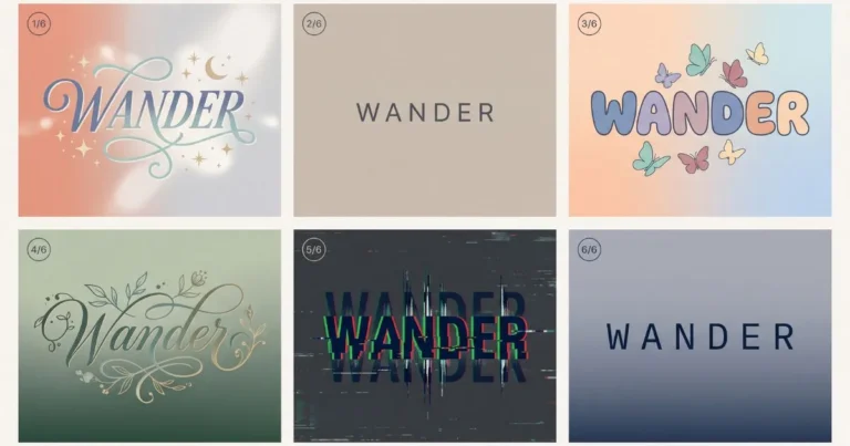
Bold in a business bio reads as authoritative. Bold in a teenager’s gaming profile reads as energetic. Cursive on a wedding photographer’s account reads as elegant. Cursive on a software company’s account reads as confused.
Typography does not carry fixed meaning — it carries meaning relative to audience expectation. Before choosing a style, look at what accounts in your category are doing. Not to copy them, but to understand the baseline you are working against.
The Accessibility Consideration
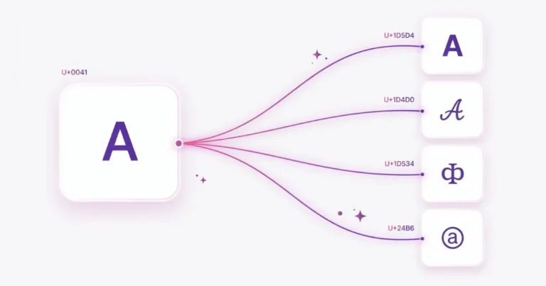
One practical note that belongs in any honest discussion of styled text: screen readers announce Unicode styled characters by their formal character names rather than reading them as ordinary letters.
For a single styled name, this is a minor friction — the user can usually infer the name from context. For an entire bio in styled text, it becomes a genuine barrier.
This aligns neatly with the restraint principle. Style one element, keep the rest plain, and your profile stays readable for everyone regardless of how they access it. Good typographic practice and accessible practice point the same direction here.
Making the Choice
Three questions to work through:
What does your audience expect in your category? Look at ten successful accounts in your space and note the pattern.
What single quality do you most want to communicate — warmth, authority, precision, energy, or restraint? Match the style to the quality, not to your personal aesthetic preference.
What one element deserves the styling? Usually the name. Sometimes a tagline. Rarely both.
Then test it. Paste your styled text into your actual profile on your actual phone and look at it the way a stranger would — for half a second, without reading. Whatever impression forms in that moment is what your typography is actually communicating.
Ready to experiment? Try different styles in the font generator and see which one matches the impression you want to make.
Frequently Asked Questions
Does font choice really affect how people perceive a brand?
Yes. Visual processing happens faster than reading comprehension, so typography creates an impression before the message is processed. Type designers have documented these associations for decades.
What is the safest font style for a business account?
Bold sans-serif. It signals authority without committing to a specific aesthetic, and it reads as professional across virtually every industry.
Can I use more than one styled font in my bio?
You can, but engagement data suggests one styled element performs better than multiple. Multiple styles compete for attention and reduce visual hierarchy.
Should I follow my industry’s typographic convention or stand out?
Follow it unless you have a specific reason to break it. Conventions reduce cognitive friction for your audience. Breaking convention works when the deviation is intentional and supported by the rest of your brand.
Why does my styled text look different on other people’s phones?
Different operating systems use different fonts to render Unicode styled characters. The characters are identical — the rendering varies by device.


One Comment